


SEJournal Online is the digital news magazine of the Society of Environmental Journalists. Learn more about SEJournal Online, including submission, subscription and advertising information.
October 30, 2019

Reporter’s Toolbox: News Can Net Eyeballs By Turning Dweebish Data Into Magic Maps
By Joseph A. Davis
A great data visualization can often underline and clarify whatever point a reporter is trying to make, in the process transforming a story from “meh” to “wow!”
How exactly to do that is a bigger subject than we can handle in this small space. But Reporter’s Toolbox would love to turn you on by showing off some great examples.
Data visualization is especially suited to telling environment and energy stories. For example, stories about place and scale are often the lifeblood of environmental journalism. For that reason, maps built to display large environmental datasets can reveal meaningful patterns in ways that words and charts can’t.
When the news is about geographic distribution or change, maps show the story, rather than merely telling it.
Of course, data visualization can be much more than maps. As digital journalism has evolved, so have software tools and the tools for user interaction with the data.
Here are 11 great recent examples of inspiring data visualizations. Each is worth exploring at length, and we hope in future to come back to some for more detailed dissection.
- The Most Detailed Map of Auto Emissions in America, New York Times, Oct. 10, 2019, by Nadja Popovich and Denise Lu.

Click to enlarge.
- The Great Flood of 2019: A Complete Picture of a Slow-Motion Disaster, New York Times, Sept. 11, 2019, by Sarah Almukhtar, Blacki Migliozzi, John Schwartz and Josh Williams.
- Satellite Images Show the Devastating Floods in the Midwest, Washington Post, March 19, 2019, by Bonnie Berkowitz, Laris Karklis and Tim Meko.
- 2°C: Beyond the Limit: Extreme Climate Change Has Arrived in America, Washington Post, August 13, 2019, by Steven Mufson, Chris Mooney, Juliet Eilperin and John Muyskens, with photography by Salwan Georges.
- Here’s How America Uses Its Land, Bloomberg, July 31, 2018, by Dave Merrill and Lauren Leatherby.
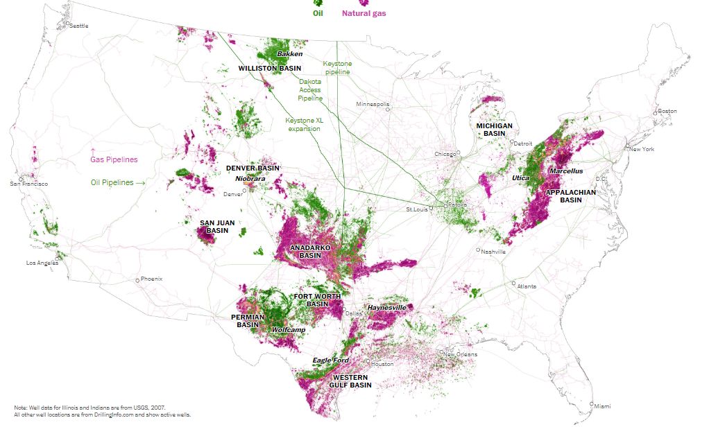
- The United States of Oil and Gas, Washington Post, Feb. 14, 2017, by Tim Meko and Laris Karklis.
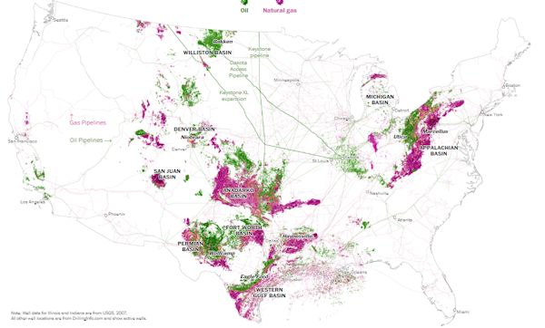
Click to enlarge.
- Mapping America’s Wicked Weather and Deadly Disasters, Washington Post, April 25, 2019, by Tim Meko.
- Visualizing the Disappearing Rivers of the American West (part of the Disappearing West project by the Center for American Progress), Mapbox, May 10, 2018, by Erin Quinn.
- This Is an Incredible Visualization of the World's Shipping Routes, Vox (UCL Energy Institute), March 22, 2017, by Brad Plumer.
- Wind Map, Hint FM/Point.B Studio (data from National Digital Forecast Database), generated hourly.
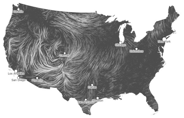
Click to enlarge.
- A Mesmerizing Map of Rainfall on Earth, CityLab (Mapbox), Nov. 3, 2015, by Kriston Capps.
Joseph A. Davis is a freelance writer/editor in Washington, D.C. who has been writing about the environment since 1976. He writes SEJournal Online's TipSheet and Reporter's Toolbox columns. Davis also directs SEJ's WatchDog Project and writes WatchDog Tipsheet, and compiles SEJ's daily news headlines, EJToday.
* From the weekly news magazine SEJournal Online, Vol. 4, No. 39. Content from each new issue of SEJournal Online is available to the public via the SEJournal Online main page. Subscribe to the e-newsletter here. And see past issues of the SEJournal archived here.
SEJ Publication Types:
Topics on the Beat:
Region:
Visibility: